Measure the selected image's encoded pixels against its CSS size and device pixel ratio before changing hosting, compression, or srcset.
An image looks crisp in the file preview but soft after it is placed on a website. When capturing interface bug reports, our screenshot to url workspace preserves exact retina pixel density for razor-sharp high-DPI display. The URL responds quickly and the file is valid, so the hosting service is an easy suspect. The more useful first question is how many source pixels the browser actually downloaded for the box it has to paint. A 320-pixel-wide file stretched across 320 CSS pixels can be enough on one screen and visibly limited on a screen that uses more device pixels per CSS pixel.
That is a pixel-budget issue, not a broken URL. It can also be an encoding or source-quality issue: a larger version of an already blurred image does not invent missing detail. Measure the selected file and rendered box before increasing every upload size.
Inspect the image that was really selected
In Developer Tools, select the visible <img> and read currentSrc. If the page uses srcset or <picture>, src may not be the URL the browser fetched. Check the rendered box width in CSS pixels, window.devicePixelRatio, and the encoded pixel dimensions of the selected file. The Network panel can show transfer size and response format; a local file inspector can confirm actual width and height independently of the DOM.
const image = document.querySelector('img');
console.log({
  currentSrc: image.currentSrc,
  cssWidth: image.getBoundingClientRect().width,
  devicePixelRatio: window.devicePixelRatio,
  naturalWidth: image.naturalWidth
});
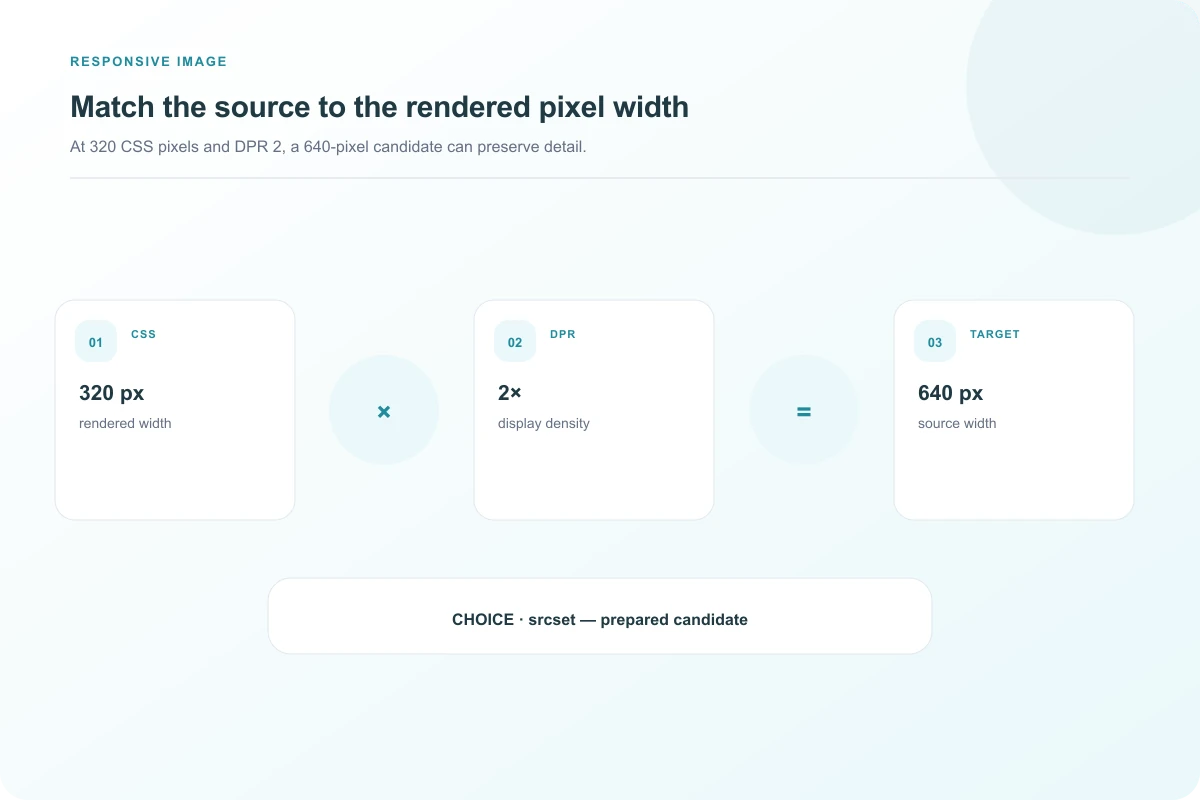
Treat naturalWidth carefully with responsive images: browsers can report density-corrected intrinsic dimensions, so it is not always the same as the encoded file width. Read the actual candidate file's dimensions as well. If the box is 320 CSS pixels on a DPR 2 display, it covers roughly 640 device pixels horizontally. A 320-pixel source cannot provide a distinct source pixel for each of those positions. Browser scaling fills the display, but fine edges and text may look softer.
An original side-by-side image test
We generated two raster images from the same fine-line artwork, one 320 pixels wide and one 640 pixels wide. Chromium 156 displayed both in 320-CSS-pixel boxes under an emulated device pixel ratio of 2. The screenshot records the source widths, chosen URLs, and identical CSS widths beside the actual images. At native screenshot size, the 640-pixel source preserves more fine-line detail. This is a controlled emulation, not a survey of physical screens or proof that every person perceives the same sharpness.
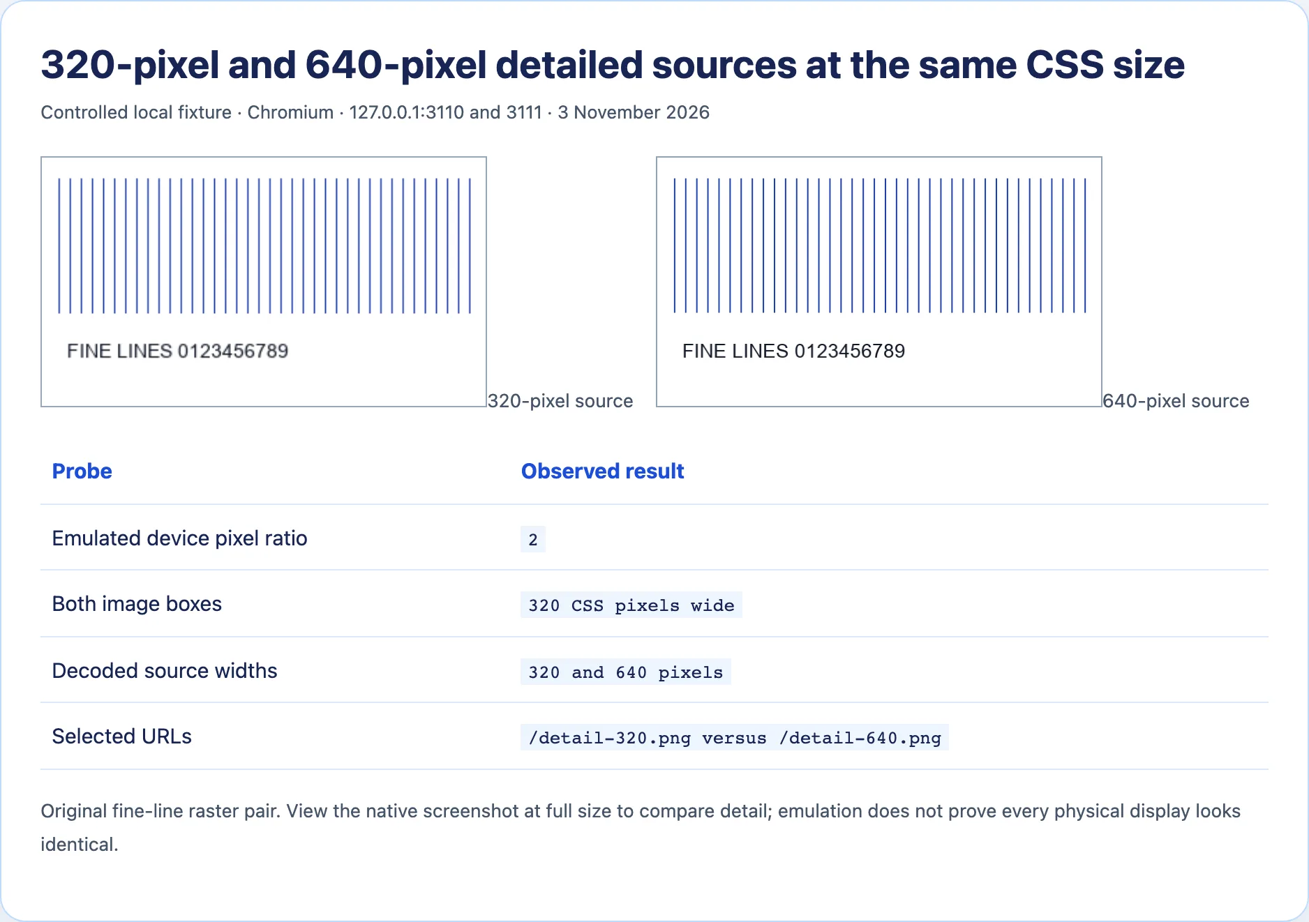
The relationship is straightforward for this fixed-size example: the larger source supplies more samples for the same visual area. It does not justify always shipping the largest possible image. More pixels cost bytes, can increase processing time, and may be wasted when the viewer's screen or layout never uses them. The correct candidate set depends on the actual display sizes and how much detail the original art contains.
Use the right kind of responsive candidate
For an image always displayed at one CSS width, density descriptors are easy to reason about:
<img
  src="/images/chart-320.png"
  srcset="/images/chart-320.png 1x, /images/chart-640.png 2x"
  width="320" height="180"
  alt="Fine-line chart with labeled axes">
The 1x and 2x candidates describe pixel density for the same intended CSS size. For a fluid image whose width changes across layouts, width descriptors and sizes describe a different problem:
<img
  src="/images/diagram-640.webp"
  srcset="/images/diagram-320.webp 320w, /images/diagram-640.webp 640w, /images/diagram-960.webp 960w"
  sizes="(max-width: 600px) 100vw, 480px"
  alt="Diagram of the upload and delivery path">
MDN's responsive-images guide explains how the browser combines candidate descriptions with layout and device characteristics. It can choose based on more than DPR alone; do not promise that a given viewport will always select one exact candidate. An incorrect sizes value can make the browser download a candidate too small or unnecessarily large for the actual CSS box. Inspect currentSrc in the rendered page rather than validating only the markup by eye.
Separate blur caused by size from blur already in the file
Open the downloaded candidate at its native pixel dimensions. If it is already soft, sending it at 2x will enlarge softness. Aggressive lossy compression can smear fine text or edges even when dimensions are sufficient. Compare the original export and hosted response at the same zoom, then check whether an image transformation service resized or recompressed it. A CDN can produce a smaller derivative than the uploaded original if its transformation URL or parameters request one.
CSS can add another layer. A transform may scale an element beyond its nominal layout width. A background image can be enlarged by background-size: cover, sometimes cropping and scaling more than expected. Fractional coordinates or subpixel positioning can change how crisp one-pixel lines appear. For pixel art, nearest-neighbor rendering may be an intentional aesthetic; for photographs, ordinary interpolation is usually preferable. Measure the painted box after transforms, not only the HTML width attribute.
An SVG illustration might avoid raster resolution limits for simple geometry, provided it is safe and self-contained in the target image context. It is not a universal replacement for photographs or complex bitmap art. If the original photo is out of focus, a vector wrapper does not recover detail. Choose a higher-quality source or a different visual when the underlying pixels are the limit.
Decide when extra pixels earn their cost
Start with the largest real display size for that image and the densities your audience commonly uses. Generate a small set of candidates from a good original, compare file sizes and visual detail, and test the page's actual selection at common widths. On a 320-CSS-pixel box, a 640-pixel source often has a clear rationale for DPR 2; a 4,000-pixel source may add little visible information while greatly increasing bytes. The tradeoff changes for zoomable diagrams or user-downloadable originals.
The final check is in the page, not the asset folder. Record currentSrc, the encoded size of that response, the computed CSS size, and the visual result at native screenshot scale. When those match the intended design, the hosted URL is doing its job. If they do not, the evidence points to source selection, transformation, layout, or original quality rather than an unspecified hosting problem.
Avoid two misleading comparisons
First, do not judge a DPR 2 screenshot after a chat application or document editor has scaled it down. The image viewer's own resizing can hide or create apparent softness. Keep the native capture and note its pixel dimensions. In our fixture, the two images occupy equal CSS boxes, but the saved browser screenshot is twice that width in device pixels. View it at full scale to compare how the 320- and 640-pixel sources feed the same destination. That is why the screenshot includes the measured source and CSS widths rather than relying on a subjective caption alone.
Second, do not compare a sharp 2x export with a different 1x composition. Both candidates should come from the same high-quality source and use consistent crop, color treatment, and content. A CDN transformation may resize and recompress one candidate differently; that can make a larger file look worse even though it has more pixels. Inspect the transformed output, not just its URL dimensions. The browser cannot restore detail lost upstream.
For a responsive layout, test a few actual breakpoints. A sizes value that says 100vw while the image is only half the viewport can cause excess download. A value that says 320px while the box grows to 700px can make a selected source too small. The browser's decision is based on the hints you provide and its own conditions. Read currentSrc after the layout settles, then measure the box. This catches mistakes that a static code review of srcset cannot.
The surrounding product design matters as well. A small decorative photo can tolerate some softness in exchange for fewer bytes, while a diagram with fine labels may need a higher-density source or vector art. Decide based on the information the image carries. If the text inside an image is essential, consider whether it belongs in HTML for accessibility and crisp rendering. That may solve the readability problem more effectively than exporting a giant raster.
When checking a hosted transformation, compare the input and delivered dimensions with a file inspector. A source uploaded at 2,000 pixels may be served as a 320-pixel thumbnail because the URL requests a width-limited derivative. Conversely, the page can download the full 2,000-pixel source into a tiny card, spending bandwidth without improving the visible result. Keep a record of both the original and transformed asset; the browser can only choose among the candidates exposed in markup and delivered by the host.
If a picture looks soft only while an animation or zoom is in progress, capture the stable final frame as well. Transforms can temporarily scale a bitmap beyond its intended size. That is a different design decision from whether the base image has enough pixels at rest. The measurement should follow the actual user-visible state that is causing concern, including modal enlargement or zoom if those are part of the feature.
A worked image-source audit
Suppose a product card displays a 300-CSS-pixel-wide image on a DPR 2 laptop. The selected candidate is a 320-pixel thumbnail, even though the upload is 2,000 pixels wide. The initial source budget is only about one pixel per CSS pixel, while the device paints roughly two pixels across that span. Inspect currentSrc to learn why the browser selected the thumbnail. Perhaps srcset offers only 320w, sizes claims the box is smaller than it is, or a transformation URL caps output at 320. Offer an appropriate candidate derived from the high-quality original and retest the rendered page.
Now suppose the selected response is 900 pixels wide but the image still looks soft. The pixel budget is no longer the obvious limit. Compare the hosted response with the original at the same display size. A low-quality compression setting can erase texture or fine lines; an already blurred upload cannot be repaired by selecting a larger derivative. Check whether CSS scales the image beyond the 300-pixel box during a hover transform. The next fix follows the observed loss of detail, not the file's nominal width alone.
The same audit should record transfer size. A source that is three times wider and taller can contain many more pixels, which may cost more bandwidth. Modern formats and suitable compression can reduce that cost, but quality and size must be compared on the actual content. Fine line art, a photograph, and a transparent UI screenshot respond differently to encoding. Choose candidates that preserve the information the user needs at the sizes the design actually shows.
For implementation review, keep a small table of viewport width, DPR, computed CSS width, currentSrc, encoded width, and transferred bytes. That evidence makes source-selection mistakes visible and prevents a blanket “serve 2x” rule from overloading small screens or missing fluid layouts. A larger file is useful when it supplies detail the display can use; otherwise it is merely more data to download.
Sources and research
Original 320- and 640-pixel fine-line raster fixtures were displayed at the same 320-CSS-pixel size in Chromium 156 with emulated DPR 2 on 3 November 2026. Physical-display sharpness was not surveyed.
- MDN: Responsive imagesDensity and width descriptors let browsers select image candidates for different layout and pixel densities.
- Apple: Serving images to Retina displaysArchived conceptual explanation of CSS pixels and denser physical pixels, not current implementation advice.
- WordPress community: Images sharp on Retina but not regular displayA user reports perceived sharpness differences; the original assets were not independently inspected.